
Design foundations
RIGHTMOVE | 2023
A case study on how we built our Design foundations in the Apps team. Coming up with processes, documentation, ceremonies and a robust Design System to elevate the app experience while improving our efficiency when delivering features.
We went from being a team whose focus was to copy website features with no set design principles nor direction, to a team with its own design identity, ways of working and strong ux maturity.
Context
Creating design processes & ways of working
Team
1 Product Designer (me), 1 Product Owner, 1 Engineering Manager, 3 Android Engineers, 4 iOS Engineers, 3 Back-end Engineers, 2 QA
Role
Senior Product Designer
Period
Feb 2021 - Ongoing
Problem
Rightmove had always been a web first platform, and while there are many teams dedicated to designing the website. There’s only one team that's focused on the app.
When I joined, that team was very much delivery focused. The priority was to reach parity of features with the site, what led to copy-pasting website designs into the app, and not designing from an app-first perspective.
There was no focus on product discovery, user research or design ceremonies. And as the designs where inherited from different teams, there was no consistency across screens. Each feature would have its own style, use different layouts and components.

Approach
COLLABORATION
Previously design and engineering worked as two different phases of the project. The engineers were not involved in the discovery, and the role of the Designer ended when the designs were handed over to the team.
The big drawback was that many times technical limitations, edge cases or missed scenarios came up during development. Resulting in last minute fixes, bugs or negative user feedback.
So we decided to shift towards a more collaborative methodology, where design and engineering work together in every stage of the project.

MAKE DESIGN TRANSPARENT
We started running regular design sessions with everyone in the team. The topics varied from ideation workshops, sharing research findings, coming up with assumptions to test, mapping out user flows or just check ins to share design progress.
This helped the engineering team be involved in evert stage of the design, with plenty of opportunities to raise concerns or give feedback. And it helped me understand what scenarios I often fail to consider and how the front-end and backend systems work.
RESEARCH & TESTING
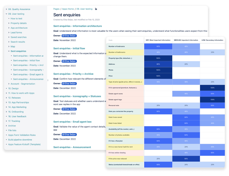
Design is more than figma files, is about how we work. So a vital part of creating our design foundations was to set up processes for research.
We started using usertesting.com, doing 3 to 4 tests per months. What gave us the ground to propose improvements, and start making features app-specific.
Now we were taking a proactive approach towards design, challenging and proposing solutions tailored to the app. We documented all our insights and decisions in a confluence folder accessible to all teams. We were breaking silos and quickly became the go-to team for user research.
MAKE DESIGN FILES ACCESSIBLE
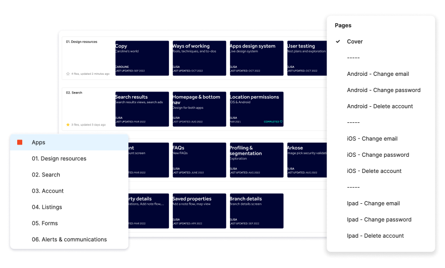
Some files had screenshots of the app, some had designs that were never implemented, and most were about specific features that were different to what was live.
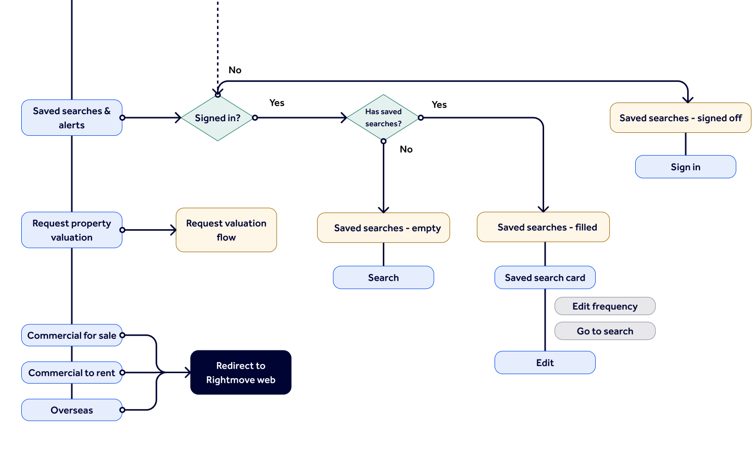
So I worked in recreating the entire app in figma, one file per screen. I then created a file where I saved all components, so rather than have components around different pages they all lived in the same place.
This way the files starting evolving with the app, always showing the latest version. And that file with all the components was the beginning of our ‘Design System’ .
FROM FIGMA TO THE CODE
Once we had established our design system basics in Figma, we worked together towards bringing those into the apps, standardising colours, fonts and buttons across ios and Android.
This is an ongoing process that took many months, but today there almost no screens that are not built with reusable components and our design system is becoming more and more robust.
Having these modules made developing much easier for the team in terms of coding and testing, and it has also helped with design consistency across the apps.

Results
PRODUCT MINDSET
By reducing back and forth between design and engineering, we were able to dedicate less time to fixing issues and more time focusing on the product. What translated to a better understanding of our app users, their needs, and building better user experiences across the app.
APP LED INITIATIVES
We have started challenging and proposing solutions tailored to the app. One example is that for the first time we launched an app only feature: Push notifications that increased by 60% the leads sent per user, and by 29% the time spent on the app.
CONSISTENCY - CODE AND DESIGN
We now have one shared design system with common terminology across code and design. Our design files mirror exactly what’s live in the app and are used by everyone in the team.
INCREASED EFFICIENCY
Now our development is done based on reusable modules, that are easier to maintain and ensure all our screens are aligned and consistent.
HIGHER STORE RATING
With more app-led initatives, we were able to improve the user experience of the app, what translated to an increase in our average Appstore and Playstore ratings from 4.3 to 4.7 in two years.
MORE INVESTMENT
We convinced the board to increase investment in apps, so as of 2024 there will be another apps team with more resources and time to focus on creating an exceptional app experience.