
Data dashboard
INNOVATION GROUP | 2020
As part of my work in Innovation Group, our team designed a new dashboard where our various audiences (body shops, dealers and insurance companies) could see the key insight of each report along with a visual representation of the results.
Context
Improvement of an existing page
Team
1 product manager, 1 product owner, 3 front-end engineers, 2 product designers
Role
Product designer for the report previews (widgets)
Period
July 2020 - December 2020
Problem
The big challenge with designing the dashboard was that it needed to be used by multiple audiences, and the content of the reports could vary significantly depending on the use case. So the dashboard needed to be flexible enough to cater for all these use cases, and modular so it can grow and expand over time.
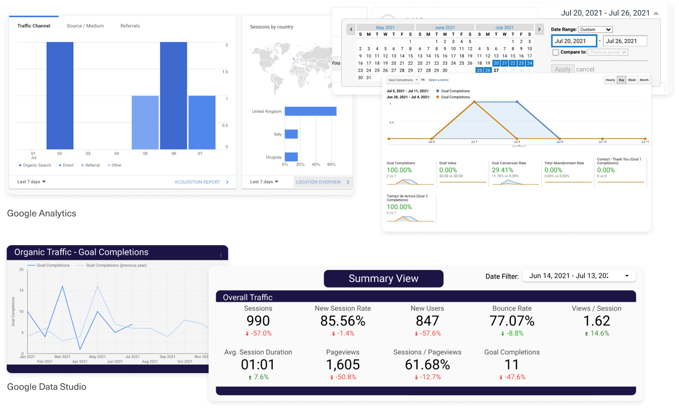
Competitor research
For understanding what are the industry standards in terms of reporting, we reviewed several data visualisation tools. Below are some of our key highlights:
- Google Analytics has excellent data comparisons, highlighting the correct information in an intuitive and clean way.
- Google Data Studio has a good dashboard approach showing previews of Analytics and Google Search Console reports, their dashboard layout is highly customisable and easy to navigate.
- Project management tools such as Jira do a great job when it comes to menu options, dragging functionalities and hover states.
Challenges
- As the reporting platform uses both Microsoft Power-Bi and HTML/CSS, the previews had to be designed based on Power-bi components, while the dashboard structure would be built as a regular website.
- Power-Bi has a very slow performance and loads one metric at a time, so we needed to ensure only the key relevant metrics and date range comparisons were shown in each report preview.
- Each report uses its own colours and formats as there is no Design System applied for the Business Insights platform. So we needed to decide which colours and layout to use and see how to make it consistent with the other reports.
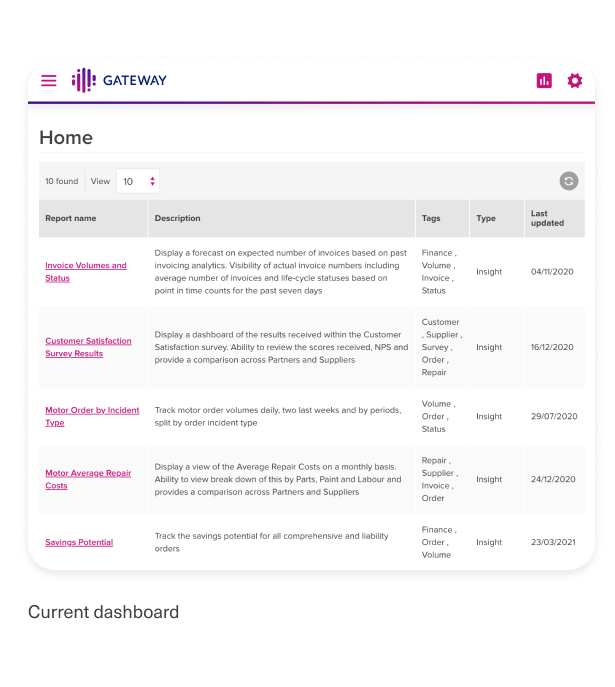
- At the moment, there is no dashboard. The insights homepage shows a table with all the reports providing minimal information and no visual representations.
Solution
METRICS
The main information users wanted to see is the current period value and the delta change, so we highlighted these values and included the previous period value and the date range references.
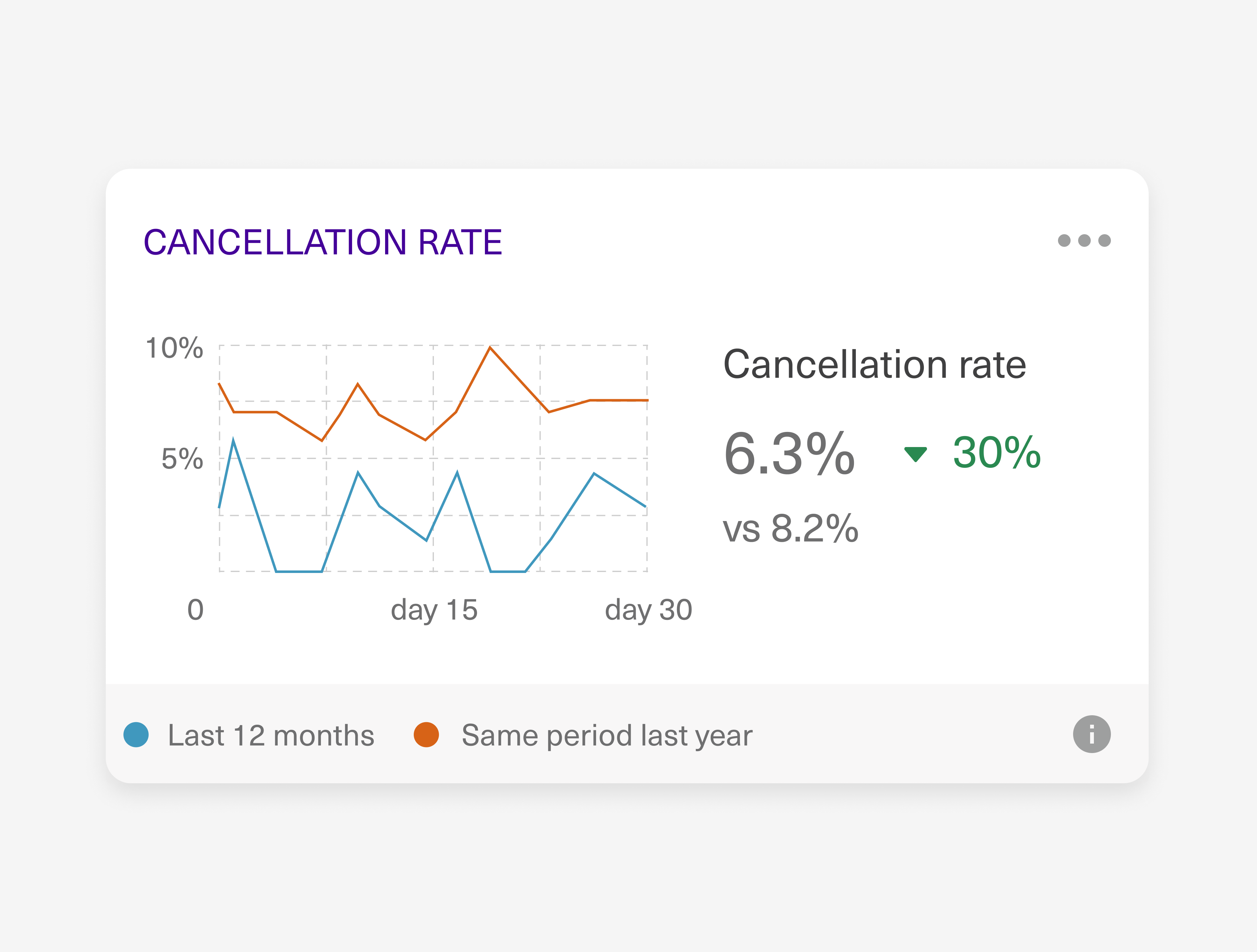
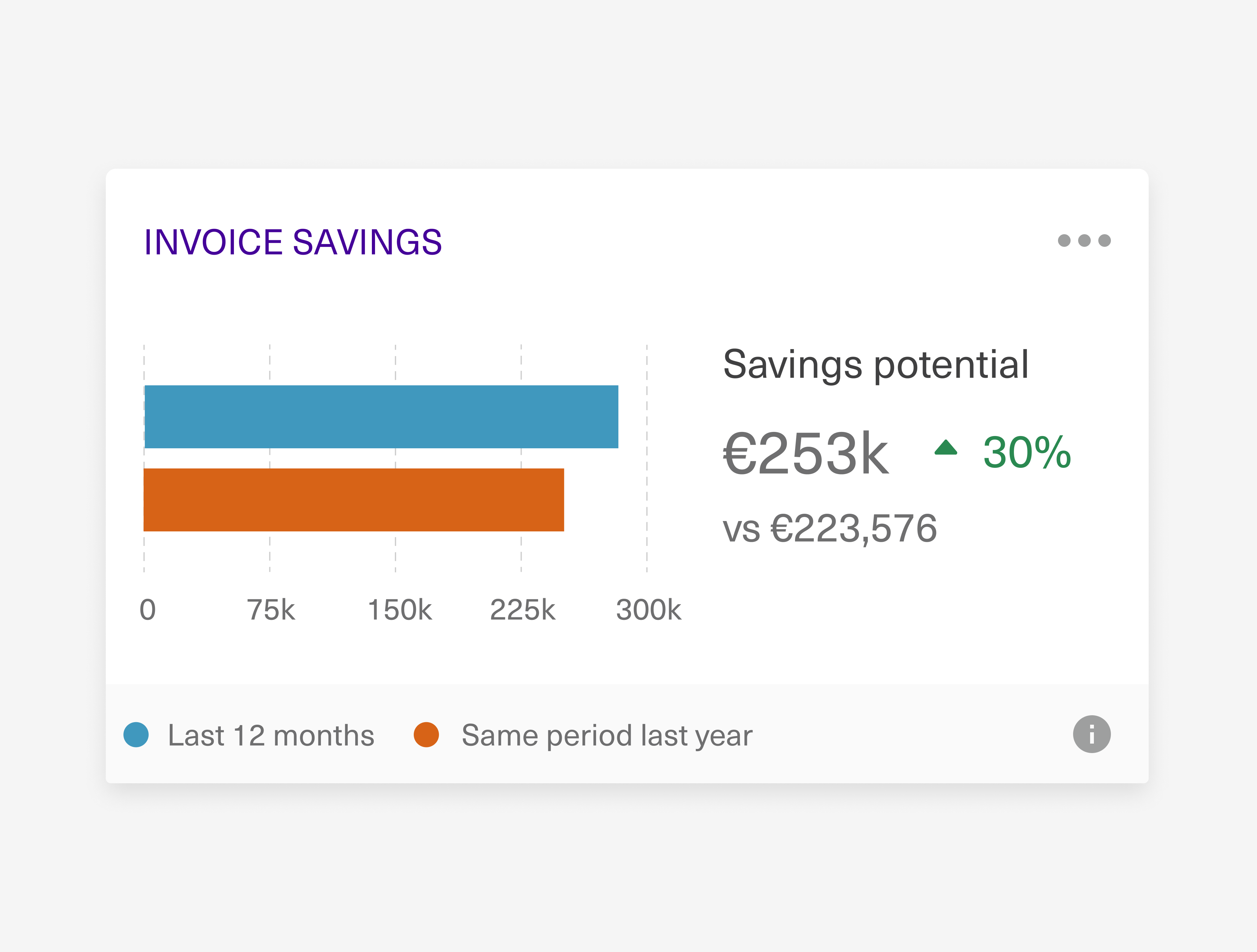
ACTIONS
We added in each report preview a settings menu, allowing users to save, add to a group and rename the report. Also, we included the date range references and a tooltip with the report descriptions and applied filters (if any).
DESIGN SYSTEM
To improve consistency, we added to our design system a set of rules and components to be used moving forward. This will help give consistency to all reports and reduce eye tension when there are multiple report previews on one same page.
What we achieved
Consistency
Based on our design system, we set up rules for colors, typography and components to be implemented globally across Business Insight, what will help with consistency across the entire platform.
Flexible design
We achieved a design that can be adapted to any report no matter the information to showcase: percentages, costs, amounts, scores, etc.
Fully responsive
The boxed layout allows each report preview to fit in different pages and its responsive behaviour caters for multiple device sizes.
Cross collaboration
There was a very good collaboration between the developers, designers and the product team. Everyone reviewed the proposal and gave their inputs from their area of expertise.
What we could improve
- Given that we don't have pre-set components, every report is built differently with different spacings and layouts, making it difficult to maintain consistency. As a next stage we should rebuild the existent reports based on the new design system.
- Because of Power-Bi performance issues, the date range comparison had to be set by default for all reports. Ideally, this should be flexible, allowing the user to change it and dynamically update the insight.