
Push Notifications
RIGHTMOVE | 2022
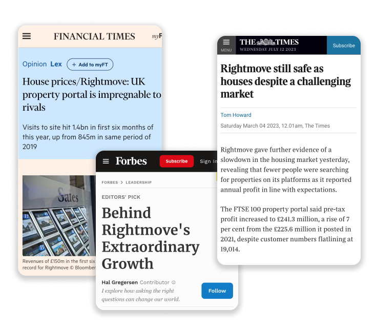
Rightmove is the market leader for searching houses to buy or rent in the UK. It's listed on the London Stock Exchange and is a part of the FTSE 100 Index. The site and app receive over 150M views per month, making it one of the top visited platforms in the UK.
Given how dynamic the housing market is, there was a need to have more immediate notifications when new properties come up. Just in 2022 we received around 300 requests for this feature through app feedback.
Context
Implementing a new feature
Team
1 product designer (me), 1 product owner, 1 ux copywriter, 1 engineering manager, 3 android engineers, 3 back-end engineers, 2 QA
Role
Sole product designer for apps
Period
July 2022 - July 2023
Problem
Given how dynamic the housing market is, there was a need to have more immediate notifications when new properties come up. Just in 2022 we received around 300 requests for this feature through app feedback.
Approach
Users wanted to get notified when there're new properties that match their saved search. But looking at the bigger picture, only 2% of users saved searches and an even lower number set up alerts. This was because the experience for saving a search and turning on alerts lacked discoverability and the interfaces were too complicated.
So we decided to first redesign the experience of saving and managing a search, then implement push notifications and finally improve the discoverability of saving a search. We wanted to be able to measure the results of each phase individually, to isolate the impact of each change
Results
% open rate
x higher than email CTR
% more users saving searches
% more searches saved per user
% more leads per user
% more sessions per user
% more time spent per user
% more saved searches
Redesign
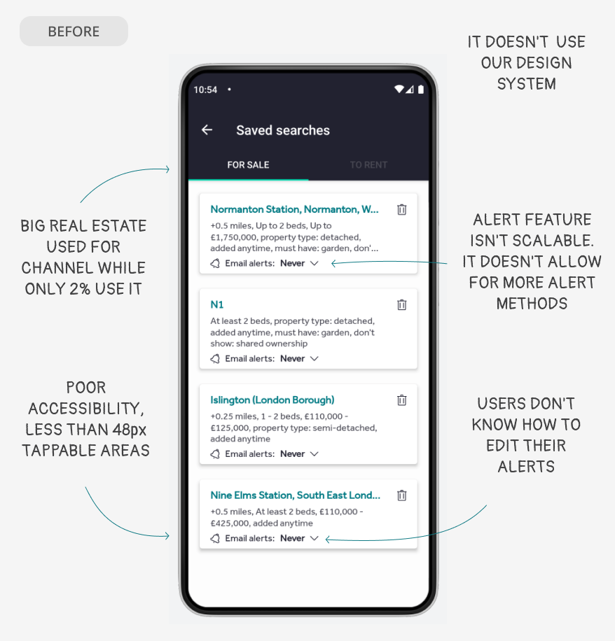
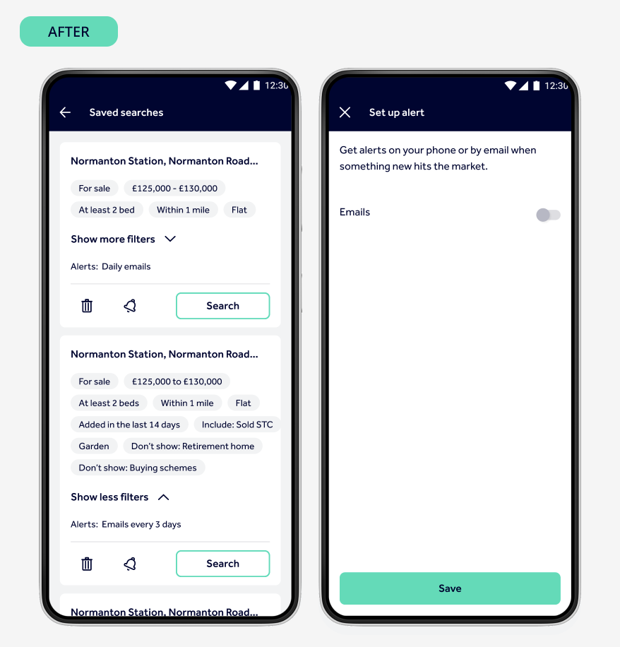
The first milestone was to redesign the save and manage search screens, while maintaining the existent functionality.
KEEP ALERTS SEPARATE
We decided to separate the flow for setting up an alert from the 'Saved searches' screen and treat it independently, so if in the future we want to set up alerts in other contexts we can reuse the screen.
RETHINK HOW WE SHOW RENT/SALE
By looking at data we found out that only 2% of logged in users have saved searches for both rent and sale. And most cases, this is because their needs changed over time and they still have old saved searches in their accounts. Therefore we decided to remove the rent and sale menu, and instead show the channel as one more filter.
REDESIGN THE 'SAVED SEARCH' CARD
We were receiving feedback of users confusing saved searches with saved properties. During testing we noted that they thought the filters summary was a property description, so we opted to use tags instead.
BIGGER CARDS MORE SCROLLING?
We were aware that one drawback of the new design could potentially be the size of the cards, as now the users need to scroll more to see more saved searches. But by looking at the data we noted that 65% of users save less than 3 searches. So it is unlikely users will have to scroll much in this screen
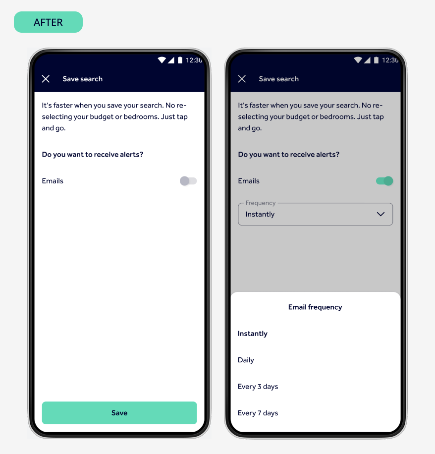
SIMPLIFIED EXPERIENCE
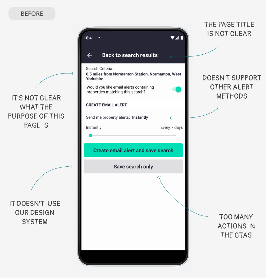
There was some button logic in this screen (if alert toggle off - show 'Save search only' button. If toggle on show both CTAs). We decided to remove these, and keep only one Save button, using the toggles for defining what to save.
COPY THAT SPEAKS TO THE USER
We looked into the copy for this screen and removed all unnecessary text. Focusing on adding friendly, conversational copy that shows users the value of saving a search.
Results
We wanted to know the impact of having improved the UI of the save search and manage searches screen, so we run an A/B test for 8 days in Android comparing the current experience vs the new design.
% more users saving searches
% more searches saved per user
% more alerts saved per user
Push notifications
The next milestone was to implement push notifications. We did several user tests and workshops with the team in order to define the implementation. We had to look into the permissions flow of the different OS versions, understand how users expect notifications to behave, and also map out all the edge cases.
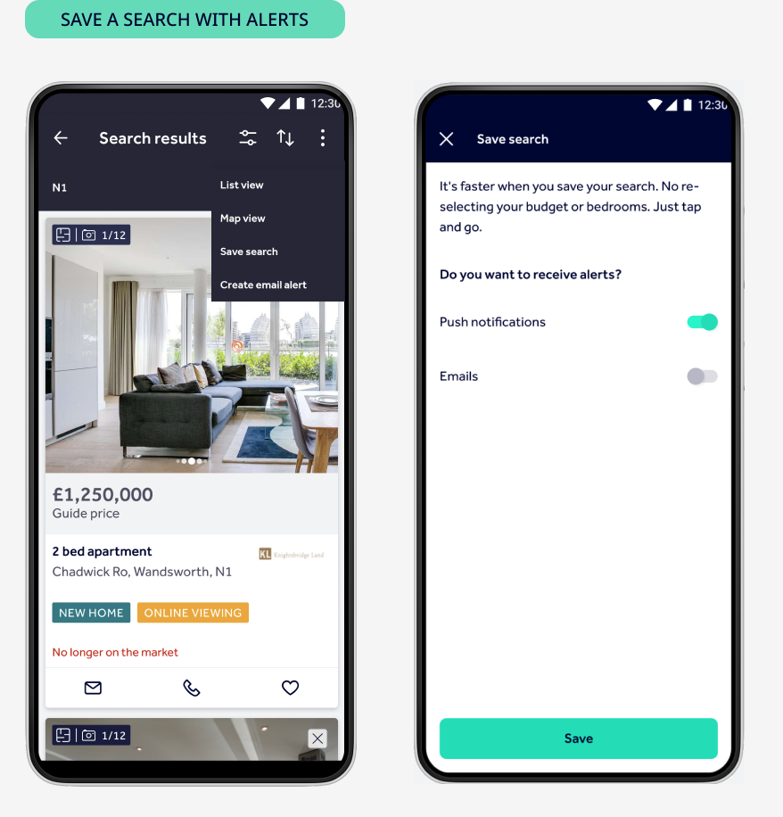
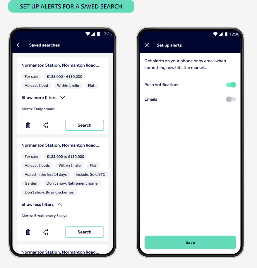
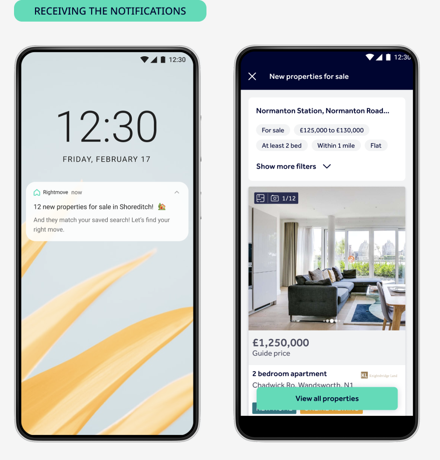
PERMISSIONS
One of the biggest challenges was to define how we would ask the users for permission for sending them notifications. It had to be contextual and informative. For example, we had to consider cases when one same user could have notifications on their phone, but off in their tablet for the same search.
COPY TESTING
We user tested different copies for the notifications, we wanted them to be conversational, aligned with our tone of voice and useful. Working within the character limits was a constraint, but we managed to come up with a short and friendly copy that resonated with users.
LANDING SCREEN
We weighted the options of sending users to the search results vs sending them to a landing screen, and we opted for the latter as it was more aligned to what users expected. We also included a button to the search results, and also in the footer a section to turn off the alerts for the search.
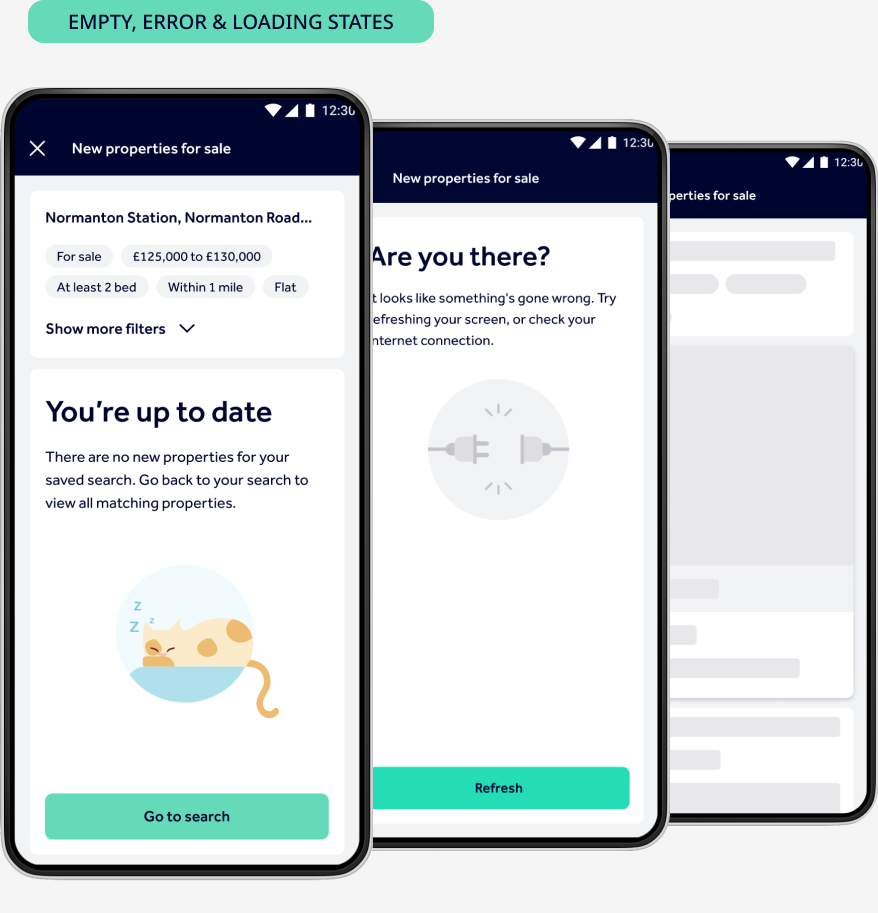
EMPTY, ERROR AND LOADING STATES
We also looked into empty states, loading states and error states for the journey. We wanted to use these 'failed' scenarios to bring little moments of delight to users, and make even the error and loading experiences enjoyable.
Results
We run an A/B test in Android between users with push notifications and users without, and the results were quite impressive.
% of users turned on notifications
% open rate
x higher than email Click Through Rate
% more leads per user
% more sessions per user
% more time spent per user
Discoverability
One of the key user problems was that they were not aware they could save searches in the app, let alone set up alerts. Making the save search more obvious meant rethinking the search results screens (gallery, list and map views). And for each one of the views we needed to not only understand the user needs but also the technological limitations implied.
We worked on these search results improvements in 3 phases, to be able to measure the results of each change separately.
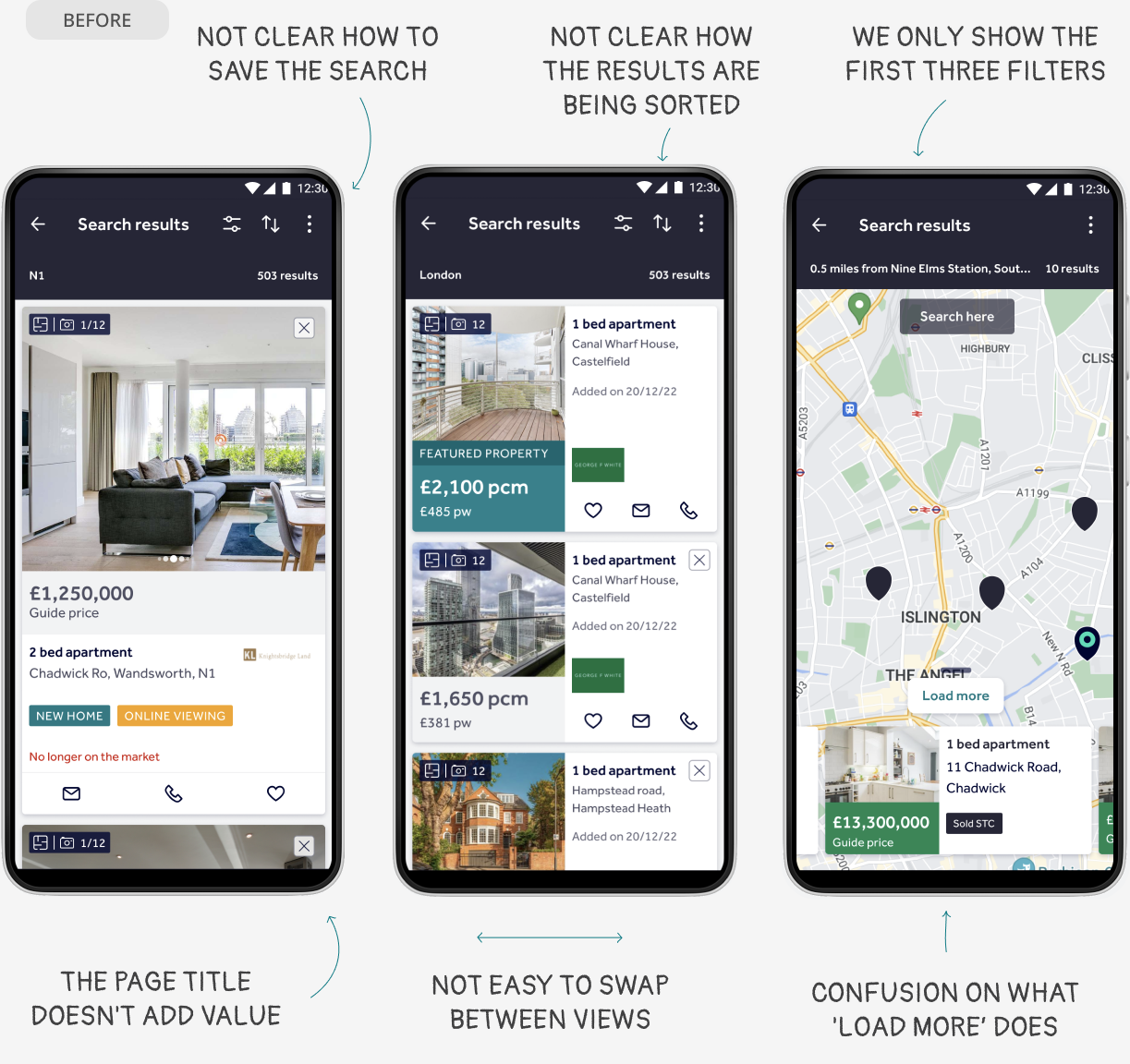
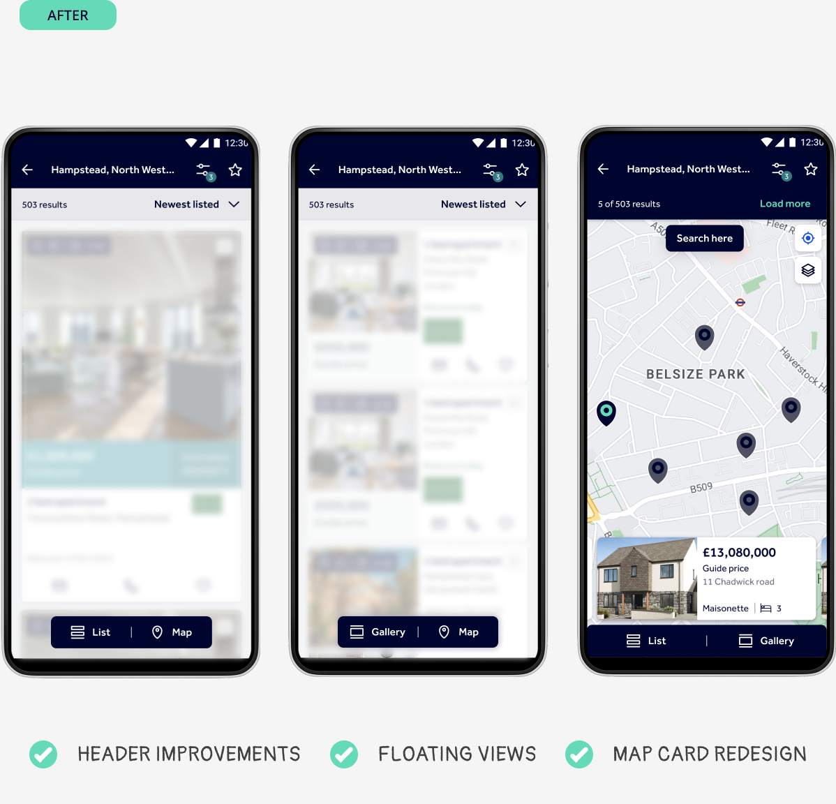
PHASE 1
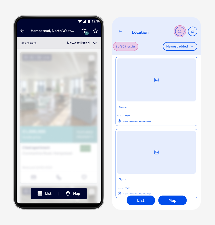
First we focused on moving out the 'Save search' action from the options menu, to see if this would have an impact on the number of people saving searches. To do this we also had to rearrange some elements of the header and make some UI improvements:
- Replace the header copy ‘Search results’ for the location the user is searching on
- Remove the sorting icon from the primary menu to leave space for the star.
- In the secondary menu of gallery and list views, add a sorting dropdown, and in maps use the space for the 'Load more' button (pagination technical limitation)
- Integrate the Design system fonts and colours
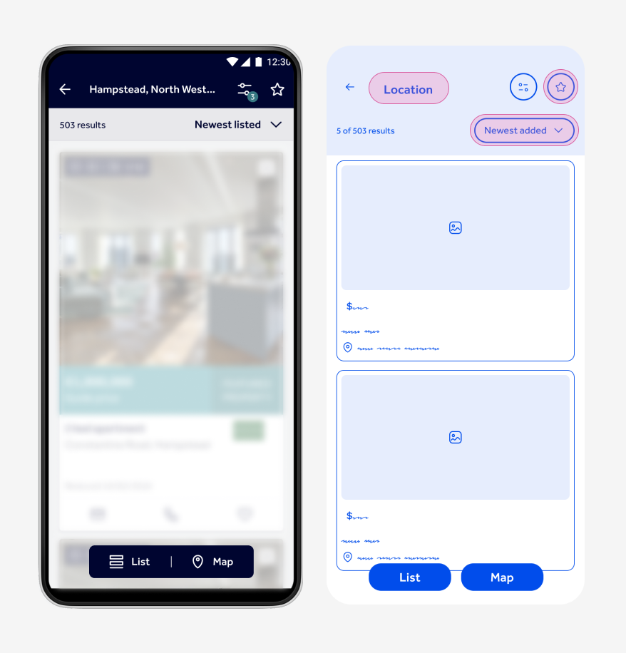
PHASE 2
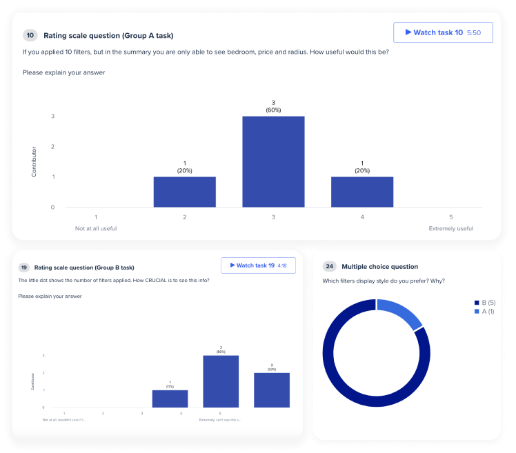
Next we removed the price, bedroom and type filter summary, and replaced it for a filter badge. During testing we found out that the number of filters applied brought more value to the users than the filter excerpt. As this involved removing information from users, we decided to release this next change on its own to monitor user feedback.
PHASE 3
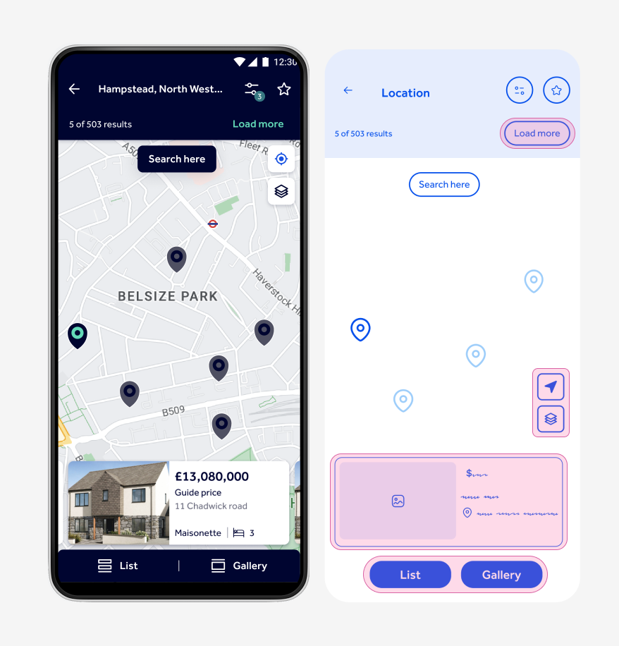
Lastly we wanted to expose the buttons for changing the views, and remove the options menu. The reason behind this, is that less than 0.5% of users interacted with the menu, leading to most users not being aware they could change how to view their results. To do this we did the following:
- Create a bottom bar in the map to swap between views
- Redesign the map cards reducing them in size to leave space for the views bar
- Rearrange the location of the elements inside the options menu in the map view
Results
We are running two A/B test to measure the results of the search results redesign, and we are already getting excellent resultss.
% more saved searches
% more searches saved with push notifications on
How we made it happen
+50 user tests
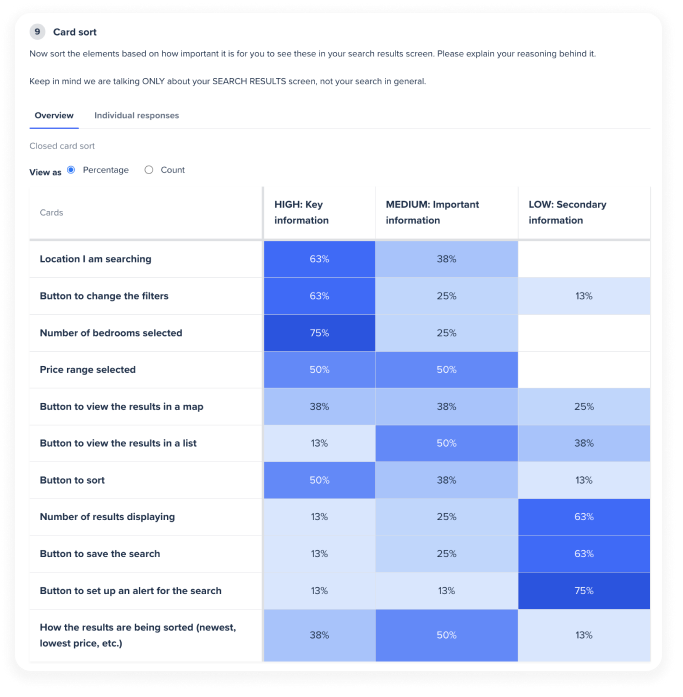
We relied heavily in user testing, we listened to more than 50 users in 9 rounds of tests. We used various testing methods from Card sorting to define the hierarchy of elements, Tree testings for architecture, design comparisons to compare versions and App behaviour tests to delve into the pain points of the current experience.
4 A/B tests
Given our app is used by millions of people, we need to be absolutely certain of the success of a new design before launching it. So our team monitors each one of the experiments closely in Google Analytics to decide the next steps.
+20 design sessions
Our team consists of a combination of Quality Assurance, Backend and Front-end app engineers, that together with Product helps shape each project we work on. We run bi-weekly design sessions, so everyone can have a saying in the features we design.
Infinite sign-offs
Design and QA work hand in hand when it comes to signing off work. We do collabortive sessions where the engineers show the features they are working on, and together with QA and Design we refine the small details, animations and interactions. This helps elevate the product, and ensure all edge cases are considered.