Track vehicle repair
INNOVATION GROUP | 2021
As part of my work in Innovation Group, our team was asked to design a new platform so users can view the status of their vehicle repairs.
Context
Improvement of existing product
Team
1 head of product, 1 product owner, 3 front-end engineers, 2 product designers, 1 lead product designer
Role
Product designer
Period
May 2020 - July 2020
Problem
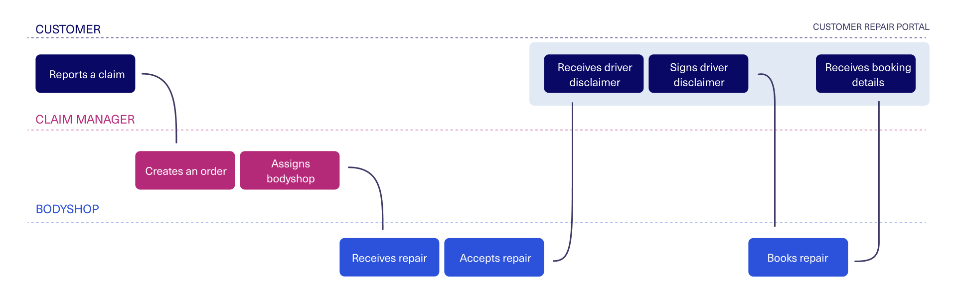
After a customer has been in a car accident and reported the claim to their insurer, the insurer will send them an email or text message with a link to view the status of their repair. Here they can see information such as their repair booking date, the details of the repairer, and when their vehicle will be ready.
Open prototypeMethodology
Our approach in this project was to follow the Design Sprint methodology to understand the problem and get feedback from all parties involved. We organised three workshops in which we invited architects, developers, product managers, and delivery managers. The first workshop was to understand the problem, the second one to define the scope of work, and the third one to sketch possible solutions. And based on those insights we worked on prototyping and validating our proposal.
Given the current pandemic, meeting in the office was not possible, so we had to do it virtually using tools such as Microsoft Teams as our meeting platform, Mural as our whiteboard, and Figma for our design collaboration.
We used Google Design Sprint as our guide but adapted the methodology to make it remote-friendly, ensuring the sessions would be short, interactive and effective.
STEP 1 - UNDERSTAND
On the first day, we ran a workshop to understand how the portal currently works. We structured this as lightning talks, we invited experts from different areas and gave them 5-10 minutes to explain the existent journey, and what problems we are trying to solve.
As a next stage we brainstormed some ideas on how we could improve the experience, we added post-its on what are the main problems and how can we address these.
STEP 2 - DEFINE
The following day we run the second workshop to define which journey we would be designing and the most important aspects to focus on. We voted on the ideas from the day before and then mocked up the product journey we would sketch on step 3.
STEP 3 - SKETCH
On Step 3, our last workshop day, the goal was to get everyone (no matter their drawing skills!) to sketch solutions for the defined journey. So we asked all participants to draw one solution every 4 minutes, getting at the end 8 drawings per person. This helped us understand which direction we wanted to go, discuss alternatives and visually see how the portal would look.
STEP 4 - PROTOTYPE
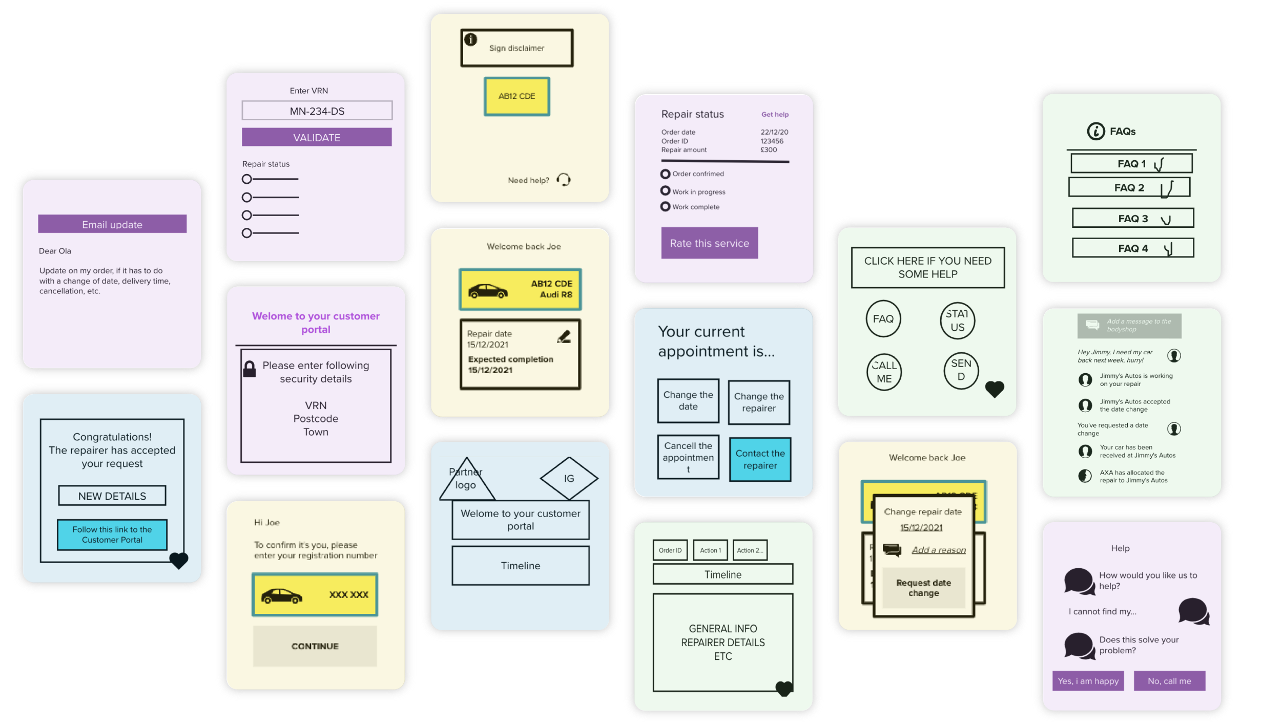
After the three workshops, we met with the design team to review the insights obtained and prototype. We started with wireframes and low-fidelity mockups to visualise the journey and draft some ideas.
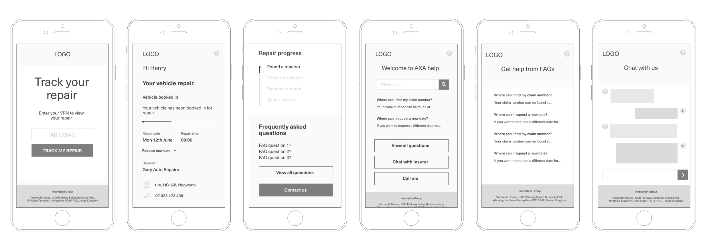
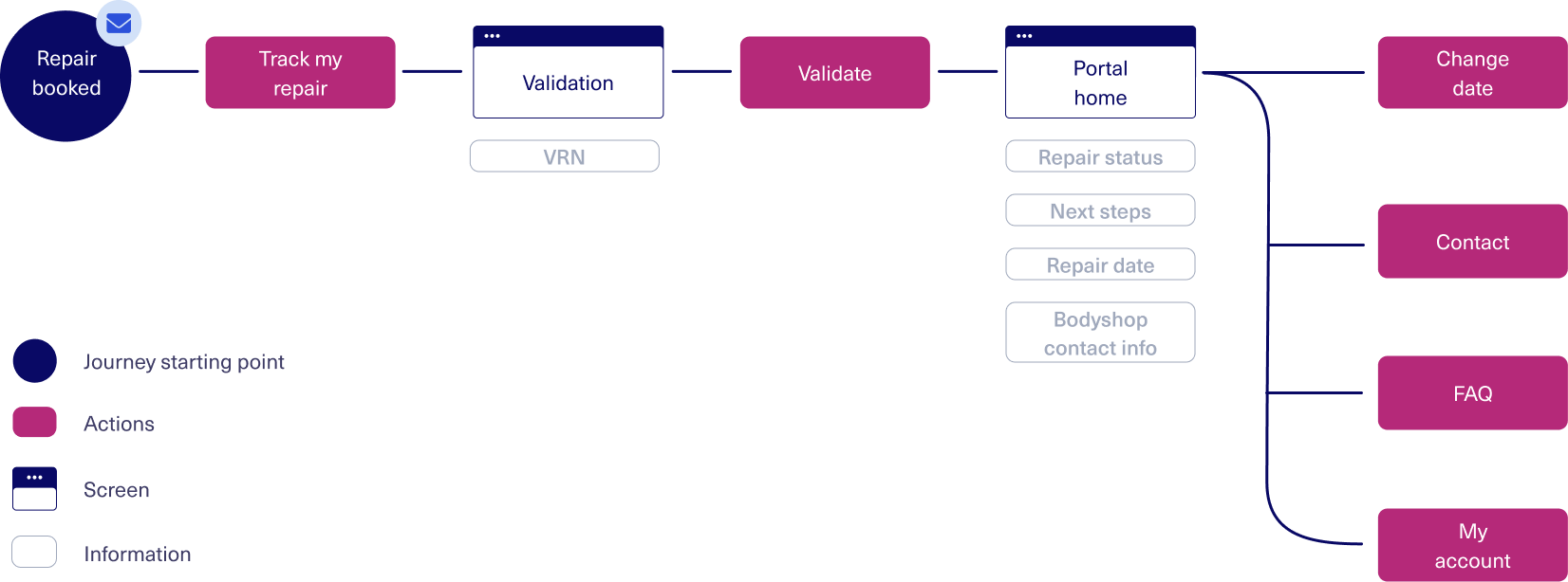
Once we agreed on an approach, we worked on the high fidelity prototyping. We needed to show two journeys: First the journey for the customer to sign the driver disclaimer as soon as the bodyshop has been assigned. Secondly, the journey for when the repair has been booked in and the customer receives the details on their appointment. In the second journey, we also cover an edge case where a customer has more than one vehicle repair open, and also a vehicle hire.
Sign disclaimer prototype Repair booked prototypeSTEP 5 - VALIDATE
Our validation process consisted of 4 stages:
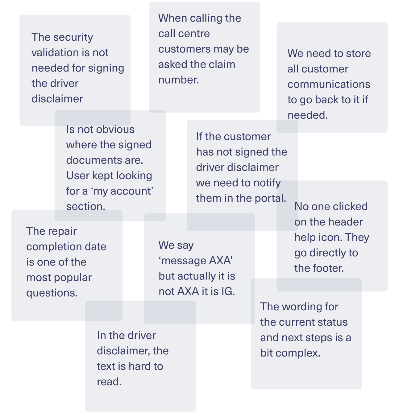
- Technology: We reviewed the proposal with the engineering and architecture team to ensure feasibility. From this sessions a few changes came up, like removing the security validation from the driver disclaimer signing journey.
- Business: To ensure the redesign matched our business goals, we run it with product representatives from different areas. One of the requests that came up from this session was about the need to store all customer communications for further reference.
- Call centre: As one of the goals of the portal was to reduce the number of phone calls our call centre receives, we interviewed some call centre workers to get insights on the most frequent issues and queries. One of the insights that came up was the need to show the claim number upfront, as customers are usually asked this number when calling the insurer.
- Customers: We run a task analysis test with customers to see how they interacted with the new interface. We tested two journeys, one for signing the driver disclaimer, and the other one for viewing the booking date. One of the insights we got, was that users were not clicking the help icon in the header but instead going to the FAQ section in the bottom of the page, so we decided to remove it in the next iteration.
Solution
Repair status
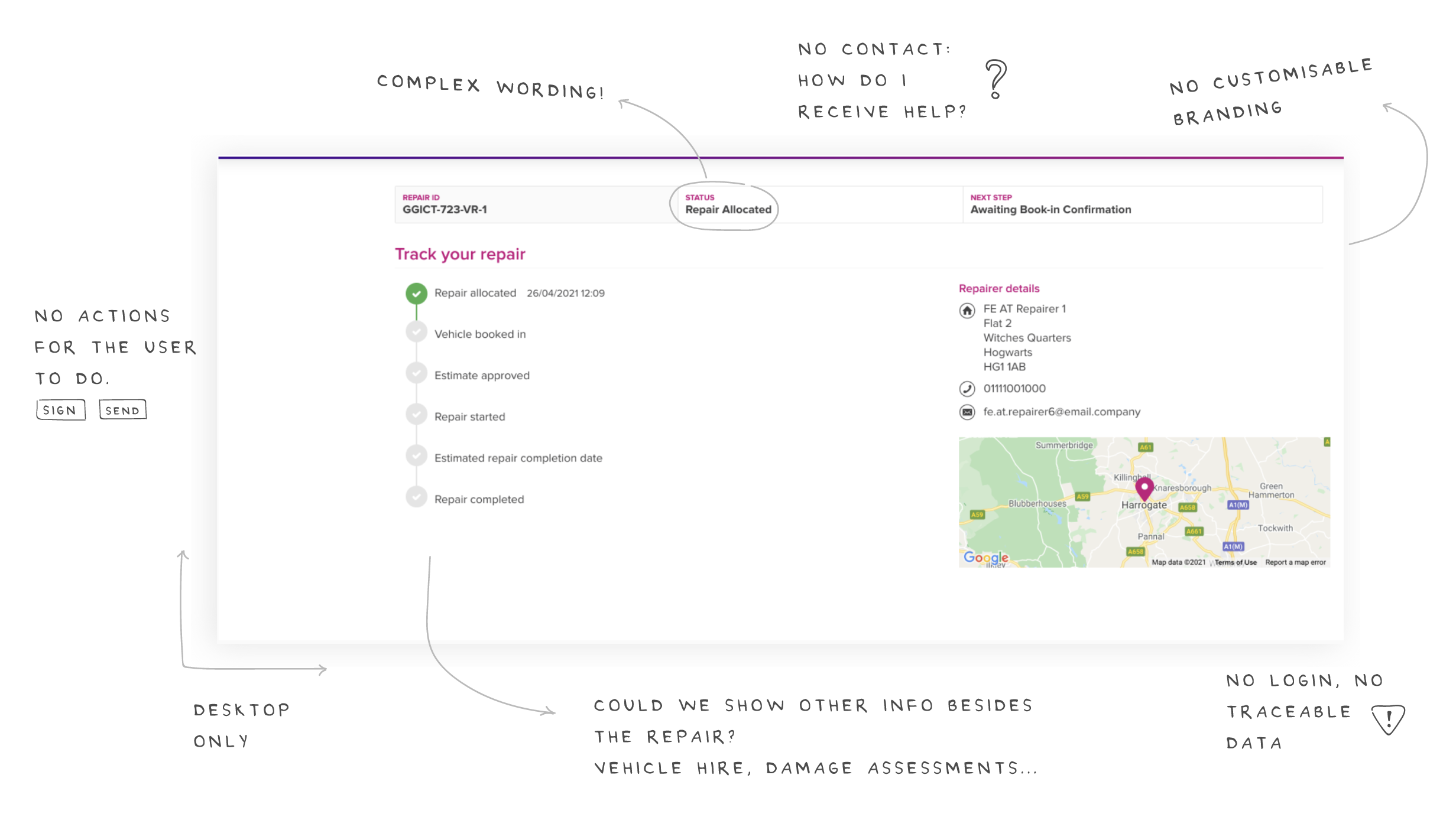
The main goal of the portal was to show users the status of their claims (repairs, hires, etc.), explaining the next step and what is needed from their end. In our workshops, we discussed the functionality of allowing users to change the repair date, but due to development limitations, we had to postpone this feature for a future upgrade and focus only on the MVP at the moment.
To protect sensitive information, we implemented a level of security before entering the portal. As soon as users click the button on the email, they are asked to enter their Vehicle Registration Number, data we can validate from when they first reported the incident.
HELP FEATURE
We included Frequently Asked Questions and an inbox centre, as it came as a business requirement to keep track of the conversations and understand which queries were pending and resolved. Initially, the chat with the insurer was going to be a bot, but we had to go with a regular message functionality due to MVP limitations.
ACTIVITY & ACCOUNT
We included an activity section, where users can view the latest activity regarding their repair, and an account section with the inbox, documents and other account settings. In our first mapping of the journey, we focused on including activities that needed repairer approval, but later on in the process, we moved towards actions that are more straightforward and don't require confirmation, more like notifications.
CUSTOM BRANDING
We designed an interface that caters for different logotypes and brandings, as whitelabeling was one of the key goals from the business side. We used bright blue as the neutral colour for links and buttons and integrated the brand colour in the header and illustrations across the page.
What we achieved
High fidelity prototype
As the entire design team was involved in the final UI decisions, we created a very polished interactive prototype that is close to how it will be in real life.
Horizontal collaboration
Thanks to our workshops, we got inputs from representatives from diverse areas: design, development, product, delivery and top management, what made the results richer and ensure they meet each area requirements.
+ 15 user testing sessions
As part of our validation we carried out more than 15 user testing sessions. Each session was very in-depth and insightful in its own, helping tailor the app to the real user needs and expecations.
Team-building
The workshops were fun and helped improve the team morale. Everyone was very looking forward to our sessions.
What we could improve
- In our online workshops, sometimes participants got distracted and were multi-tasking while being in the session. We should ensure the workshops are quick and highly interactive.
- Some technical limitations came late in the process. Having had these in the beginning, the sprint would have been more efficient.
- During the survey, we asked users to test two prototypes, one per journey. But when doing so, users were confused about how to open the prototypes and could not test both journeys. Next time we should focus on one prototype at a time and ensure the instructions are short and easy to follow.